
Knowledge Management
|
August 14, 2025
|
9 MIN
Why Management Hierarchy Charts Are Crucial for Organisational Success
When a startup founder said, "We’ll figure out structure later," they probably did not expect that lack of structure would eventually sink the company. Yet it happens far too often. Research shows that 65 percent of startup failures stem from unclear roles, weak leadership, or team breakdowns. These are not technical problems. They are organisational ones.
A missing or poorly planned hierarchy can create a vacuum where confusion and misalignment thrive. One tool has consistently helped companies avoid this mess. That tool is the management hierarchy chart.
Back in 1855, the Erie Railroad was getting too big, too fast. Chaos followed. Daniel McCallum’s solution was to map out one of the earliest organisational charts in history. It brought much-needed clarity and helped guide a complex, growing enterprise. Today, the logic still holds. Whether you run a logistics company, a design agency, or a venture-backed tech firm, you need to see how your teams fit together. And your teams need that same visibility.
Hierarchy charts are not old-fashioned management relics. They are working blueprints for clarity, accountability, and scale.
What Is a Management Hierarchy Chart?
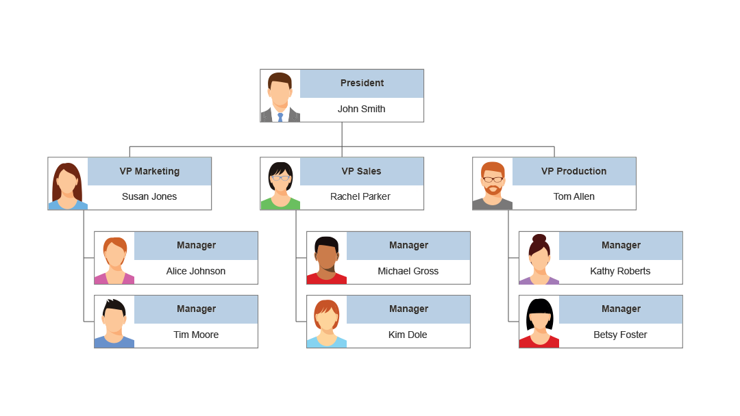
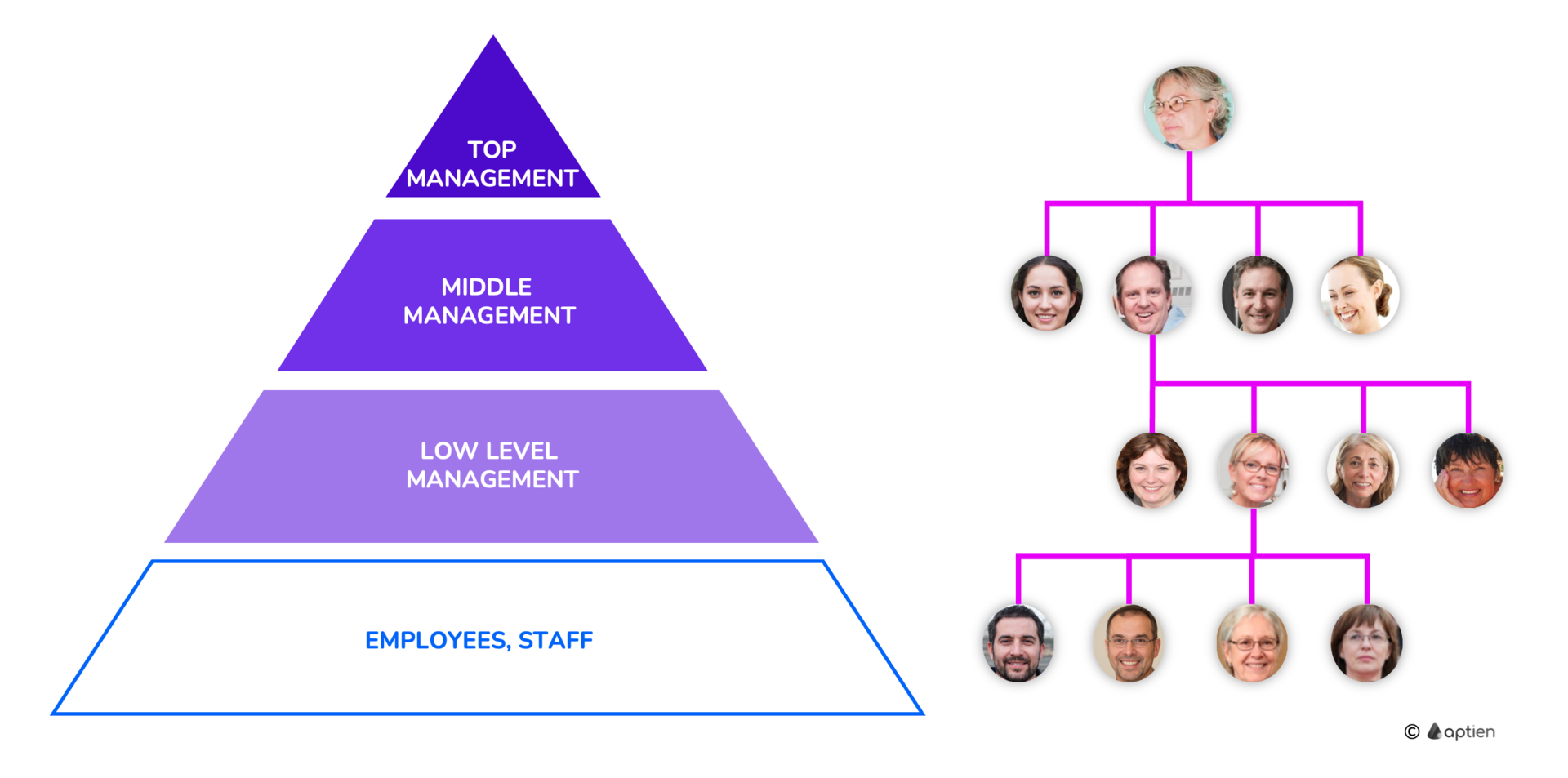
A management hierarchy chart, often called an organisational chart, is a visual layout that describes roles, authority lines, and relationships between departments or individuals inside an organisation.
It identifies who reports to whom, which roles belong to what teams, and where authority and responsibility sit. These charts are almost always shaped to resemble a pyramid, with leadership at the top and layers spreading below.
This is more than a visualization. It is a reference point for everyone in the organisation. It answers simple but essential questions such as “Who do I report to?” and “Who handles decisions in this area?”
Why Mapping Organisational Structure Matters
Visualising your structure brings more than aesthetic order. It solves real operational issues. Here are some of the ways:
It improves communication by making it clear who team members should go to for requests, decisions, or support. That means fewer delays from asking the wrong person or waiting for someone to respond who is not actually responsible.
It adds accountability by clarifying ownership. If something breaks or lags, people know which role is responsible for resolving it. That beats having tasks fall through the cracks or being passed around.
It speeds up decisions. When teams can see how reporting works, they make faster calls with more confidence. Leaders know what level of approval is needed. Employees don’t second-guess whose input to seek.
It supports planning. Whether you are trying to fill a headcount, plan for a leadership transition, or explore merging departments, the chart serves as a home base to test those changes.
It brings clarity to employees. They can trace their own role’s place in the larger puzzle and understand how their work fits into broader goals. That often supports better engagement and smoother onboarding.
Types of Organisational Structures
Your hierarchy chart reflects your structure. The structure you choose affects how information flows, how decisions are made, and how flexible the organisation can be. Here are some common models:
The hierarchical model is the most traditional. It features a clear chain of command, usually divided by departments or functional areas. In many established businesses, this format helps leaders manage large teams without chaos.
The flat model removes many layers of management. It allows employees to take ownership and move fast. But it can sometimes lead to murky leadership and lack of coordination if not handled carefully.
The matrix model allows team members to report to more than one manager. For example, a designer may report both to a creative director and a project manager for a specific client. This can better reflect real working relationships, especially in complex fields like healthcare or engineering.
The network model is popular in distributed teams and partner-heavy environments. Instead of focusing on reporting lines alone, it reflects how modules or external teams work together.
Each format has trade-offs. The goal is not to imitate a trend but to choose what suits your goals, industry, and stage of growth.
Emerging Trends in Hierarchy and Structure
Things are evolving rapidly. Technology is shaping not just how we communicate but how we are structured internally. Here are some of the key shifts:
AI is leading to flatter structures by automating routine decisions and removing some lower-level management tasks. This increases speed and leaves more room for strategy and relationships.
Remote and distributed workforces are now more common. When everyone is not in the same building, knowing who does what becomes more important than ever. A hierarchy chart becomes the source of truth for visibility and alignment.
Roles are becoming less fixed. Employees often fill more than one function or split duties across teams. A traditional org chart that reflects only formal titles may be outdated in weeks. Dynamic charts that reflect actual responsibilities are vital.
HR systems are integrating structure into how they track employee data, learning, benefits, and onboarding. This means charts do not live in a file—they are tied to the actual performance and growth of the team.
How Hierarchy Charts Work Across Industries
There is no single rule for every sector, but here is how different industries rely on structure:
In tech startups, structure usually starts light, but as the team grows, vagueness turns into a liability. A well-built hierarchy chart balances flexibility with clear ownership. It can prevent bottlenecks during product releases or funding rounds.
In healthcare or pharma, structure is essential for workflow across various disciplines. Doctors, researchers, department heads, and admin staff need layered yet connected systems. The matrix model is common here, combining clinical leadership with functional ones.
In government or education, structure is not just convenient—it is often required. Funding approvals, operating licenses, and reporting for compliance all demand that teams know where responsibilities lie and who has authority.
In private equity, clarity is central to due diligence and portfolio management. Investors need to know who runs what, where a company is vulnerable, and how teams perform under change. Hierarchy charts support those conversations with a detailed, visual footprint.
Misconceptions About Hierarchy Charts
Some think hierarchy charts are stiff, outdated, or even counterproductive. Let’s clear up a few common errors in thinking:
One myth says the charts are about control instead of collaboration. The truth is the opposite. When built well, even a traditional structure can support cross-functional collaboration by making decision channels clear.
Another common belief is that flatter always means smarter. It can, but flat teams often end up improvising authority on the fly. Lack of leadership clarity slows them down just as much as process-heavy environments do.
Many fear that hierarchies choke creativity. In reality, creative thinking often emerges more comfortably when people are not stuck in decision gridlock. Structure can serve as a safety net to let risk-taking flourish within boundaries.
Some assume that once built, charts are locked. That may have been true when charts lived on paper. Today’s tools are flexible and allow updates that reflect how the team grows or pivots. They can be scenario-based, role-based, and tied to planning tools.
Conclusion
How you organise your team is just as important as who you hire. Management hierarchy charts are not only useful for HR departments or executives. They allow everyone across the organisation to move more confidently. These charts make roles visible, decisions simpler, and team planning more responsive.
When designed intentionally, hierarchy charts are not just descriptive. They are strategic. They reveal gaps, test possibilities, and promote better scaling. They become an operating system for your organisation’s future.
Frequently Asked Questions
A management hierarchy chart is a visual representation of your organisation’s structure. It outlines roles, authority levels, and reporting relationships, helping teams understand how work is coordinated.
Start by identifying your structure type. Then map out departments, roles, and reporting lines based on how your teams actually work. Use tools that let you update charts dynamically and connect them to your planning workflows.
It depends on your business goals and team size. Smaller teams may function better with less formal structure. Larger or scaling organisations benefit from a defined hierarchy to support growth and accountability.
AI is automating routine management tasks, reducing the need for multiple layers of oversight. It also provides real-time data that can adjust structure decisions, making org charts more flexible and responsive.
Without clear roles and reporting lines, startups often run into leadership confusion. As teams grow, lack of structure creates delays, weak accountability, and fuzzy decision-making. A well-built hierarchy can prevent this.
Yes. By showing where there are gaps in leadership or skillsets, these charts guide hiring decisions and make it easier to create clear roles during onboarding.
No. Employees benefit as much as leaders. Seeing where their role fits into the whole helps them understand priorities, know who to collaborate with, and feel more connected to company objectives.
👍
What others are liking


5 Steps to outline your ideal documentation structure
5 MINS READ
Where to start the your journey of mapping out your ideal documentation structure, aligning it with the very heartbeat of your organization?
Defining a winning level of detail in your process
3 MINS READ
What is too much detail, and what is too little? This article described in that winning level detail about what detail is enough.


