Key Highlights:
- Bubble organisational charts use spheres to represent departments, making them more inviting and easier to understand than traditional hierarchical diagrams.
- These charts clarify reporting structures and inter-departmental relationships, improving communication and onboarding for employees.
- Company X's transition to a bubble organisational chart enhanced communication across divisions, illustrating the effectiveness of this approach.
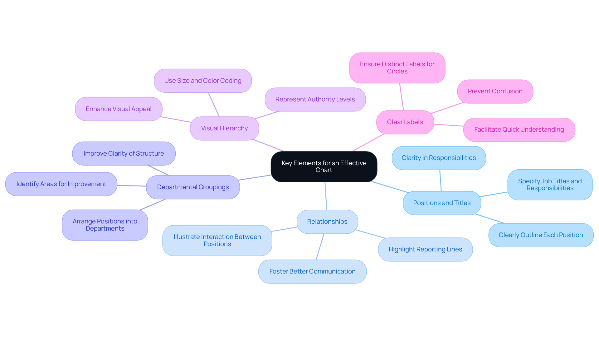
- Key elements for an effective chart include clearly defined positions and titles, illustrated relationships, departmental groupings, visual hierarchy, and clear labels.
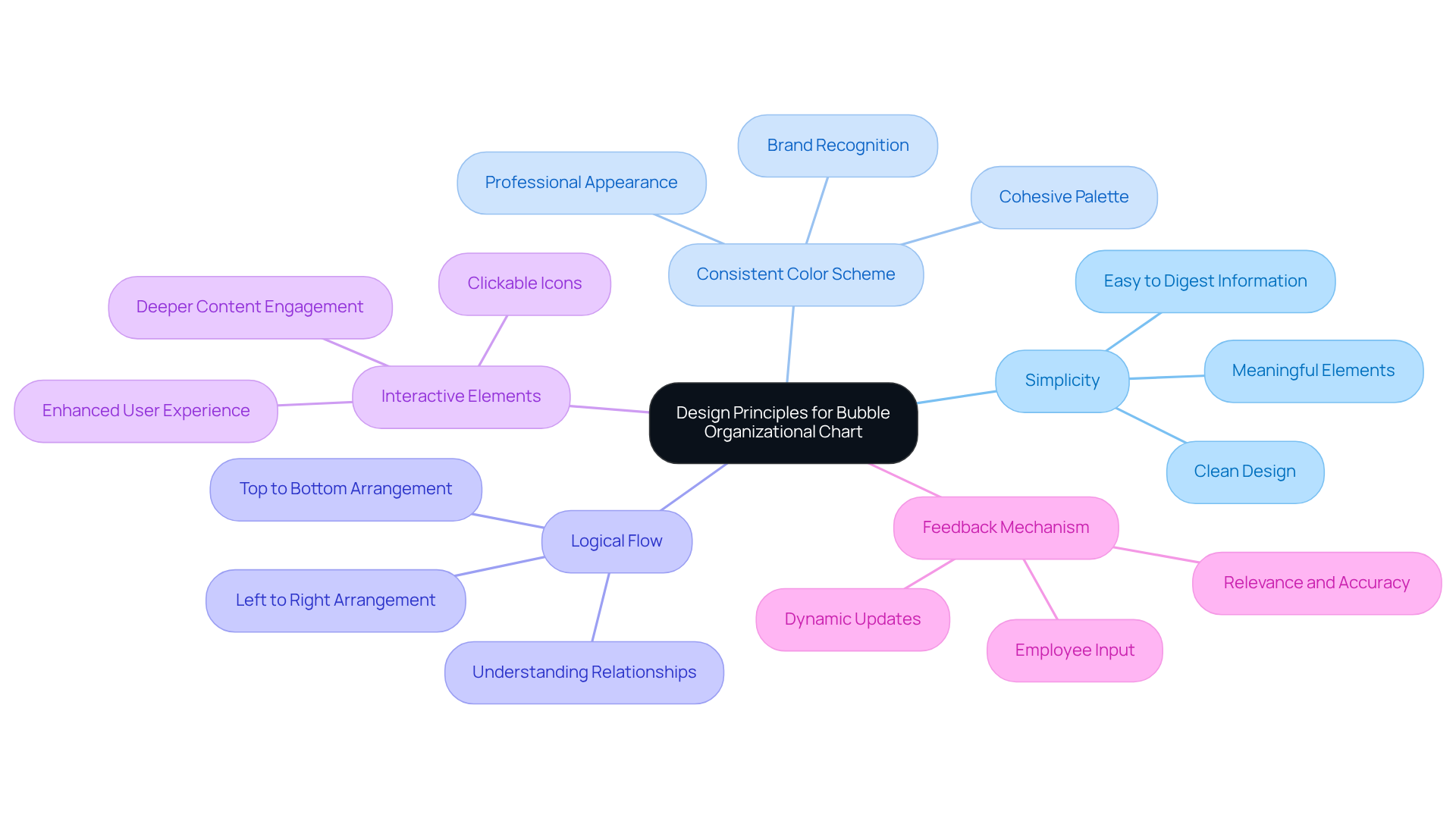
- Design principles for the chart include simplicity, consistent colour schemes, logical flow, interactive elements, and a feedback mechanism for continuous improvement.
- Regular updates are essential for maintaining the chart's relevance, with strategies such as scheduled reviews, assigned responsibilities, and employee feedback.
Introduction
You might be wondering how an effective organizational chart could really change the game for your company. Well, many businesses still stick to those old hierarchical designs that just don’t capture the complex relationships among teams. Enter the bubble organizational chart! With its inviting circular layout, it offers a fresh perspective on how departments connect and communicate, making everything clearer and boosting collaboration.
But here’s the catch: creating a chart that’s not only visually appealing but also accurately reflects the dynamic nature of your organization can be tricky. So, how can you leverage this innovative tool to foster teamwork and streamline onboarding? And how do you keep it relevant as your company evolves? Let’s dive into these questions together!
Define the Bubble Organizational Chart and Its Importance
You might be wondering how a circular organizational diagram can change the way we see connections within a company. Well, unlike those traditional hierarchical diagrams that often feel a bit stiff, a bubble organizational chart uses spheres or 'bubbles' to represent different functions or departments. This makes everything look more inviting and easier to grasp!
These innovative diagrams really shine when it comes to clarifying reporting structures and inter-departmental relationships. They help employees quickly understand where they fit in the big picture. Plus, they’re great for improving communication and making onboarding smoother. By laying out roles and responsibilities clearly, these visuals not only boost understanding but also encourage a culture of teamwork and openness.
Take Company X, for example. They switched to a visual hierarchy that transformed their traditional setup and significantly improved communication across divisions. It’s a perfect illustration of how these diagrams can really shake things up in a positive way! And let’s not forget that specialists point out how bubble organizational charts are super helpful for onboarding. They help new hires get up to speed with the company structure and key players, making their integration into the team much easier.
However, it’s crucial to keep these diagrams clear and not overcrowded with unnecessary details. Regular updates are also key to reflecting any changes in positions and reporting lines. This way, the diagram stays relevant and continues to be a handy resource for communication and onboarding.

Identify Key Elements for an Effective Chart
How can we create an effective bubble organizational chart? You might be wondering where to start! Well, there are a few key elements you’ll want to include to make it truly effective:
-
Positions and Titles: First off, clearly outline each position within your organization. Make sure to specify job titles and responsibilities so everyone knows what they’re supposed to do. Remember what Peter F. Drucker said: "There is nothing so pointless as doing efficiently that which should not be done at all." Clarity in responsibilities is crucial!
-
Relationships: Next, illustrate how different positions interact. Highlight those reporting lines and collaborative connections. This can really help foster better communication and prevent common pitfalls in structure design.
-
Departmental Groupings: Now, let’s talk about arranging those positions into departments or teams. This context improves clarity and helps everyone understand the organizational structure better. Plus, it can point out areas for continuous improvement.
-
Visual Hierarchy: Don’t forget about size and color coding! Use these to represent the level of authority or importance of each role. It makes it super easy to spot key positions at a glance.
-
Clear Labels: Lastly, ensure all circles are labeled distinctly. This prevents confusion and helps everyone grasp the information quickly. As Bryant Jones suggests, effective communication is key to operational success.
By integrating these components, you’ll transform your diagram into a bubble organizational chart that serves as a handy tool for understanding your organization’s structure. This will ultimately enhance communication and cooperation among your teams. So, are you ready to give it a go?

Design the Layout and Structure of Your Chart
When you're designing your bubble organizational chart layout, you might be wondering how to make it truly stand out. Here are some friendly tips to keep in mind:
-
Simplicity: A clean and uncluttered design is key to making sure your information is easy to digest. Research shows that effective visual communication thrives on simplicity, letting viewers quickly grasp complex structures. As John Maeda puts it, "Simplicity is about subtracting the obvious and adding the meaningful."
-
Consistent Color Scheme: Think about using a cohesive color palette that matches your organization's branding. This not only boosts recognition but also gives off a professional vibe, making your chart more visually appealing.
-
Logical Flow: You’ll want to arrange those circles to reflect the natural flow of communication and reporting in your organization, typically from top to bottom or left to right. This logical setup helps everyone understand relationships and hierarchies better.
-
Interactive Elements: How about adding some interactive features? Let users click on icons for more info about specific roles or departments. This kind of engagement can really enhance the user experience and help folks dive deeper into the content.
-
Feedback Mechanism: Don’t forget to provide a way for employees to share their thoughts on the diagram. Keeping it dynamic means it can evolve with your organization, which is super important for staying relevant and accurate.
By following these design principles, your visual structure, such as a bubble organizational chart, will not just be an informative tool; it’ll also engage employees, encouraging them to see it as a valuable resource. And hey, watch out for common pitfalls like cramming too much info into the visual or using inconsistent colors - those can really undermine its effectiveness!

Ensure Regular Updates and Relevance of the Chart
To keep your bubble structure running smoothly, it’s super important to set up a regular review process. You might be wondering, what does that look like? Here are some friendly strategies to consider:
- Scheduled Reviews: How about setting a regular timetable-like quarterly or bi-annually-to check in on the diagram? This way, you can update it to reflect any changes in roles, responsibilities, or the overall organizational structure.
- Assign Responsibility: It’s a good idea to designate someone or a team to take charge of maintaining the record. This ensures there’s accountability for those updates.
- Incorporate Feedback: Don’t forget to ask your employees for their thoughts! Actively seeking input on the diagram’s accuracy and usability can help you make necessary adjustments.
- Communicate Changes: Whenever you make updates, be sure to share those changes with the whole organization. Keeping everyone in the loop about the current structure is key.
- Leverage Technology: Have you checked out SowFlow’s documentation tools? They make it easy to update and share the diagram, so it’s always accessible to everyone. Plus, with SowFlow, you can whip up user guides that give your team instant access to the latest documentation, boosting productivity and enhancing communication.
By prioritizing regular updates and utilizing SowFlow’s solutions, your bubble organizational chart will remain a valuable resource for understanding your organization.

Conclusion
You might be wondering how a bubble organizational chart could change the way your team interacts. Well, it’s all about bringing a fresh perspective to how we visualize company structures! Instead of the usual rigid hierarchies, these charts use bubbles to represent different departments and roles, making it easier for everyone to grasp the dynamics at play. This approach not only enhances communication but also fosters collaboration among employees, which is a win-win, right?
When creating an effective bubble organizational chart, there are a few key practices to keep in mind:
- Clearly defining positions and relationships is crucial.
- Maintain a logical layout that’s easy to follow.
- Update it regularly to reflect any changes in your organization.
- Use a consistent color scheme and a simple design to boost usability.
- Adding interactive features can make the chart even more engaging.
By following these tips, you can create a tool that not only clarifies your structure but also supports ongoing teamwork and communication.
So, why should you consider adopting a bubble organizational chart? Well, it can truly transform how employees view their roles and relationships within the company. By emphasizing clarity and keeping the chart updated, you ensure it stays relevant and effective. It’s time to embrace this innovative approach! Fostering a culture of openness and collaboration can lead to improved productivity and, let’s be honest, happier employees. Who wouldn’t want that?
Frequently Asked Questions
What is a bubble organizational chart?
A bubble organizational chart is a circular diagram that uses spheres or 'bubbles' to represent different functions or departments within a company, making the structure more inviting and easier to understand compared to traditional hierarchical diagrams.
Why is a bubble organizational chart important?
It clarifies reporting structures and inter-departmental relationships, helping employees understand their roles within the organization. It also improves communication and facilitates smoother onboarding by clearly laying out roles and responsibilities.
How did Company X benefit from using a bubble organizational chart?
Company X experienced improved communication across divisions after switching to a visual hierarchy, illustrating how bubble organizational charts can positively transform organizational dynamics.
How do bubble organizational charts assist with onboarding new employees?
They help new hires quickly understand the company structure and identify key players, making their integration into the team much easier.
What should be considered when creating a bubble organizational chart?
It's important to keep the diagrams clear and avoid overcrowding them with unnecessary details. Regular updates are also essential to reflect any changes in positions and reporting lines, ensuring the diagram remains a relevant resource.
👍
What others are liking
5 Steps to outline your ideal documentation structure
5 MINS READ
Where to start the your journey of mapping out your ideal documentation structure, aligning it with the very heartbeat of your organization?
Defining a winning level of detail in your process
3 MINS READ
What is too much detail, and what is too little? This article described in that winning level detail about what detail is enough.


