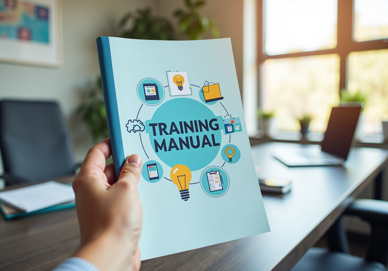
Key Highlights
- Understanding the audience's demographics and familiarity with the topic is crucial for designing a relevant training manual cover.
- Clearly stating the manual's purpose helps shape design choices to connect effectively with users.
- Interacting with the audience through surveys or interviews can yield insights that improve engagement and retention.
- Incorporating organisational branding and high-quality visuals enhances the manual's cohesion and professionalism.
- Design should facilitate easy navigation and comprehension while maintaining consistency across materials.
- Using straightforward language and ensuring readability are essential for conveying information clearly.
- Accessibility features, such as alt text for images and avoiding reliance on colour alone for information, are vital for inclusivity.
- Gathering feedback through focus groups or surveys allows for data-informed improvements to the manual cover.
- Iteration based on user feedback fosters a sense of ownership and ensures the final product meets user needs.
Introduction
You might be wondering, what’s the big deal about a training manual cover? Well, it’s more than just a design choice; it’s your first chance to make a great impression! A well-crafted cover can really boost user engagement and comprehension. By getting to know your audience and understanding the purpose behind the manual, you can incorporate eye-catching visuals and ensure everything is clear and accessible.
But here’s the kicker: how do you strike that perfect balance between looking good and being functional? And what about user feedback? This article dives into four best practices that not only amp up the visual identity of your training manuals but also make sure they effectively convey the essential information your users need. So, let’s get started!
Define Audience and Purpose for the Training Manual Cover
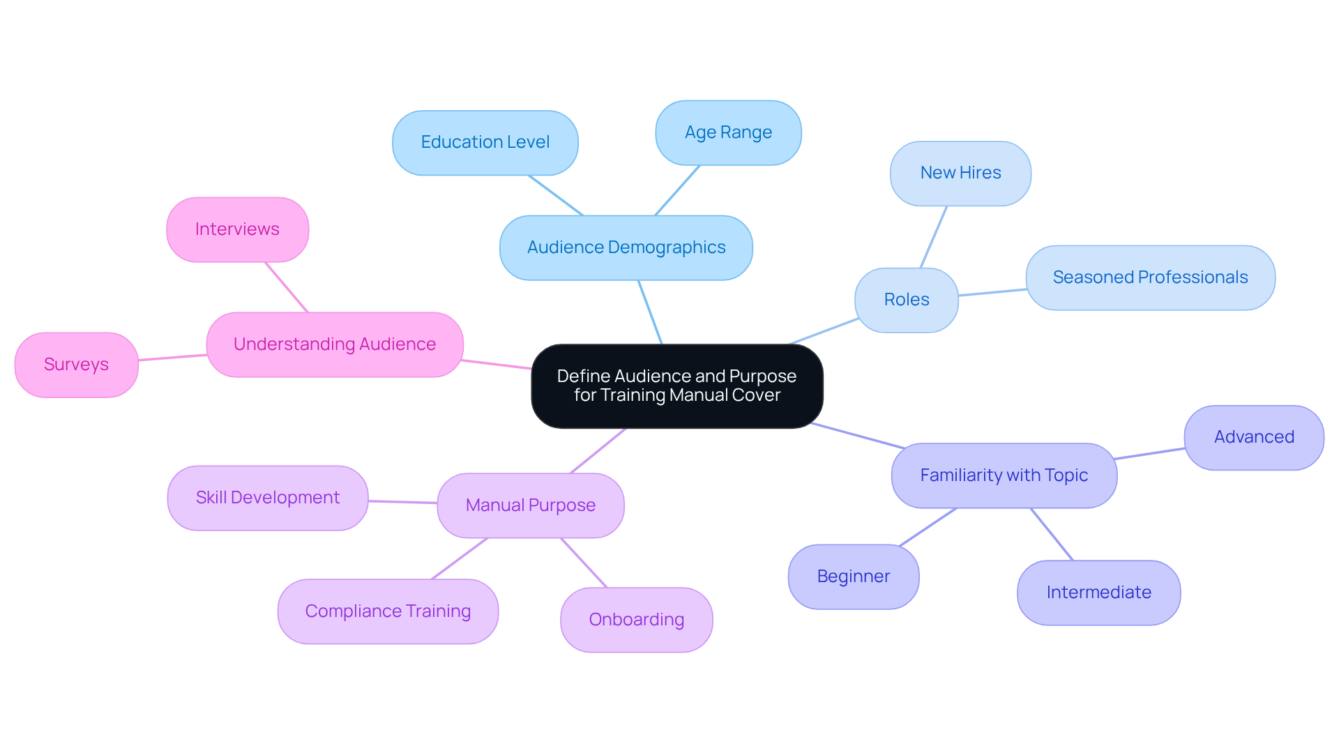
Creating an effective front starts with knowing your . You might be wondering, who are they? Think about their demographics, roles, and how familiar they are with the topic. For example, a guide for will look different than one for seasoned pros. Clearly stating the - whether it’s for onboarding, skill development, or compliance training - will help shape your design choices. This way, the front can really hit home and connect with users.
Now, let’s dive into how you can get to know your better. can provide some great insights into what they like and expect. This understanding is key! Did you know that companies tailoring their are twice as likely to see better ? By aligning your resources with what your audience needs, you can really .
Incorporate Visual Elements and Branding in the Design
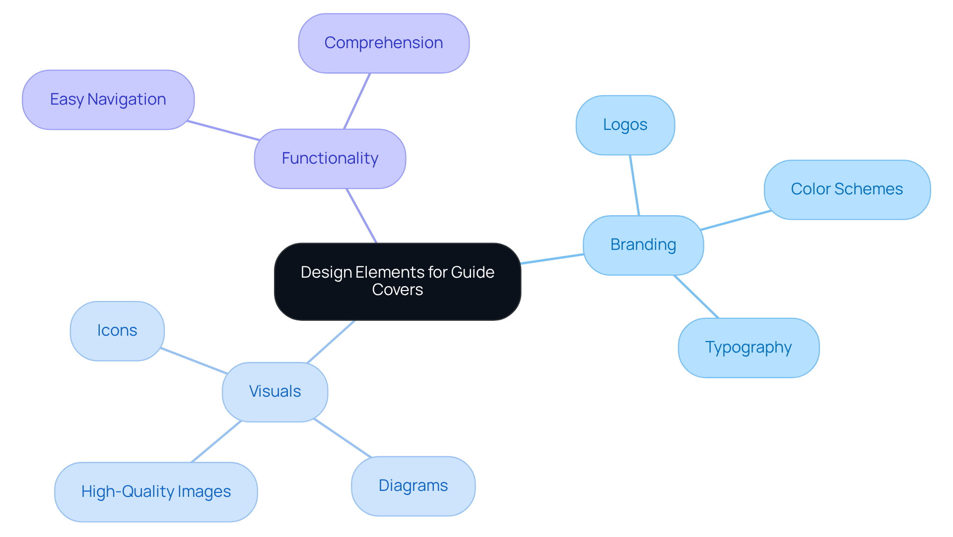
You might be wondering how visual elements can really make or break your guide cover. Well, they’re super important! Think about - like logos, color schemes, and typography. This helps create a .
Now, let’s talk about images. Using that represent the content of your guide is key. They should connect with your audience, too! For example, if your manual is for a technical educational program, why not use diagrams or icons that reflect the subject matter? It makes a difference!
But remember, it’s not just about looking good. The design should also be functional. You want it to facilitate . Consistency in visual elements across all your instructional materials will not only but also . So, what do you think? Ready to give your guide cover a fresh look?
Ensure Clarity and Accessibility of Cover Content
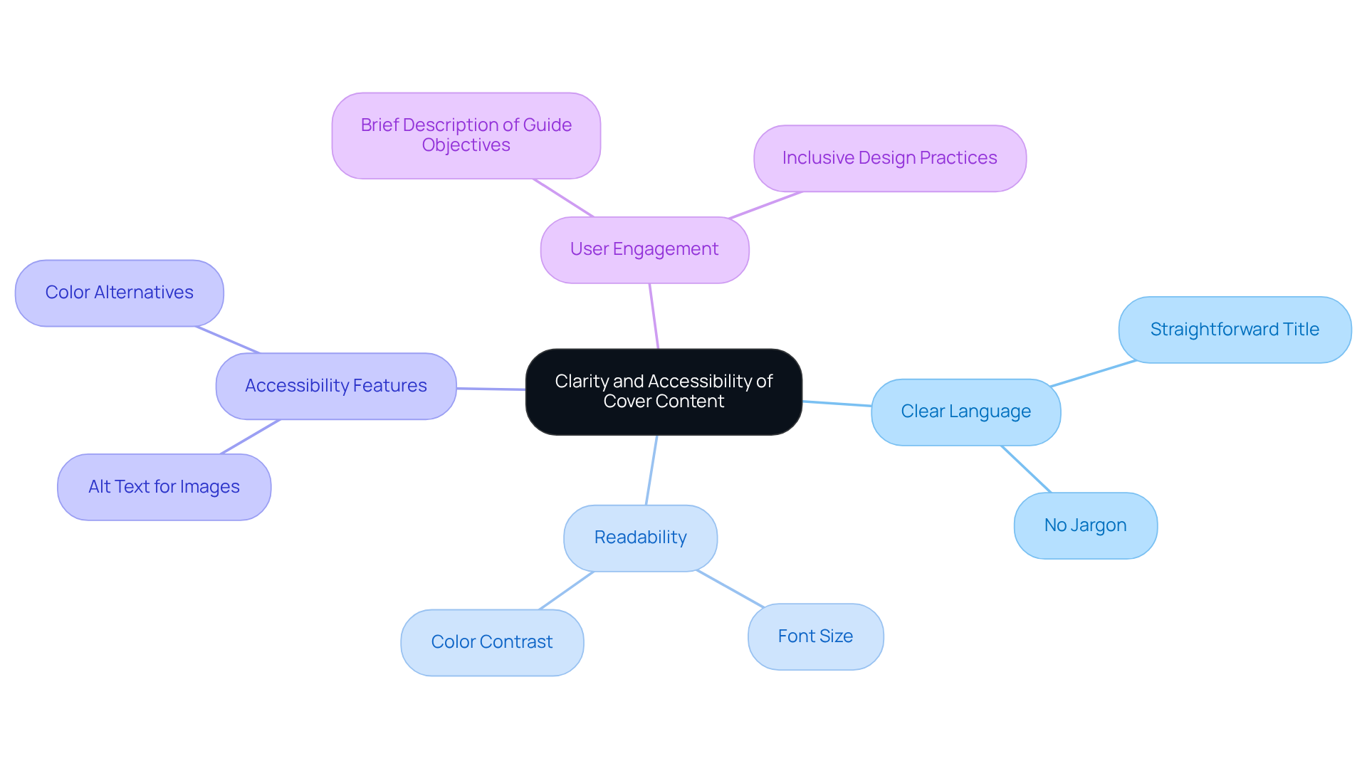
You might be wondering how to make your cover really stand out. Well, it’s all about conveying ! Stick to straightforward language for both the title and subtitle - no jargon that could leave readers scratching their heads. And don’t forget about readability! Choose a and ensure there’s a to boost visibility.
Including a brief description of what the guide covers or its objectives right on the cover can provide users with valuable context. Plus, let’s talk about accessibility - it’s super important! Make sure to use alt text for images and remember that color shouldn’t be the only way you convey information. By following these tips, you’ll create a guide that’s not just but also inclusive for everyone.
Did you know that are 60% more likely to be read in full compared to those packed with jargon? And with 55% of U.K. consumers walking away from purchases due to , it’s clear that emphasizing accessibility is a must. So, by incorporating these elements, you’re not just boosting user engagement; you’re also aligning with . Now, let’s dive into how you can implement these strategies effectively!
Gather Feedback and Iterate on the Design
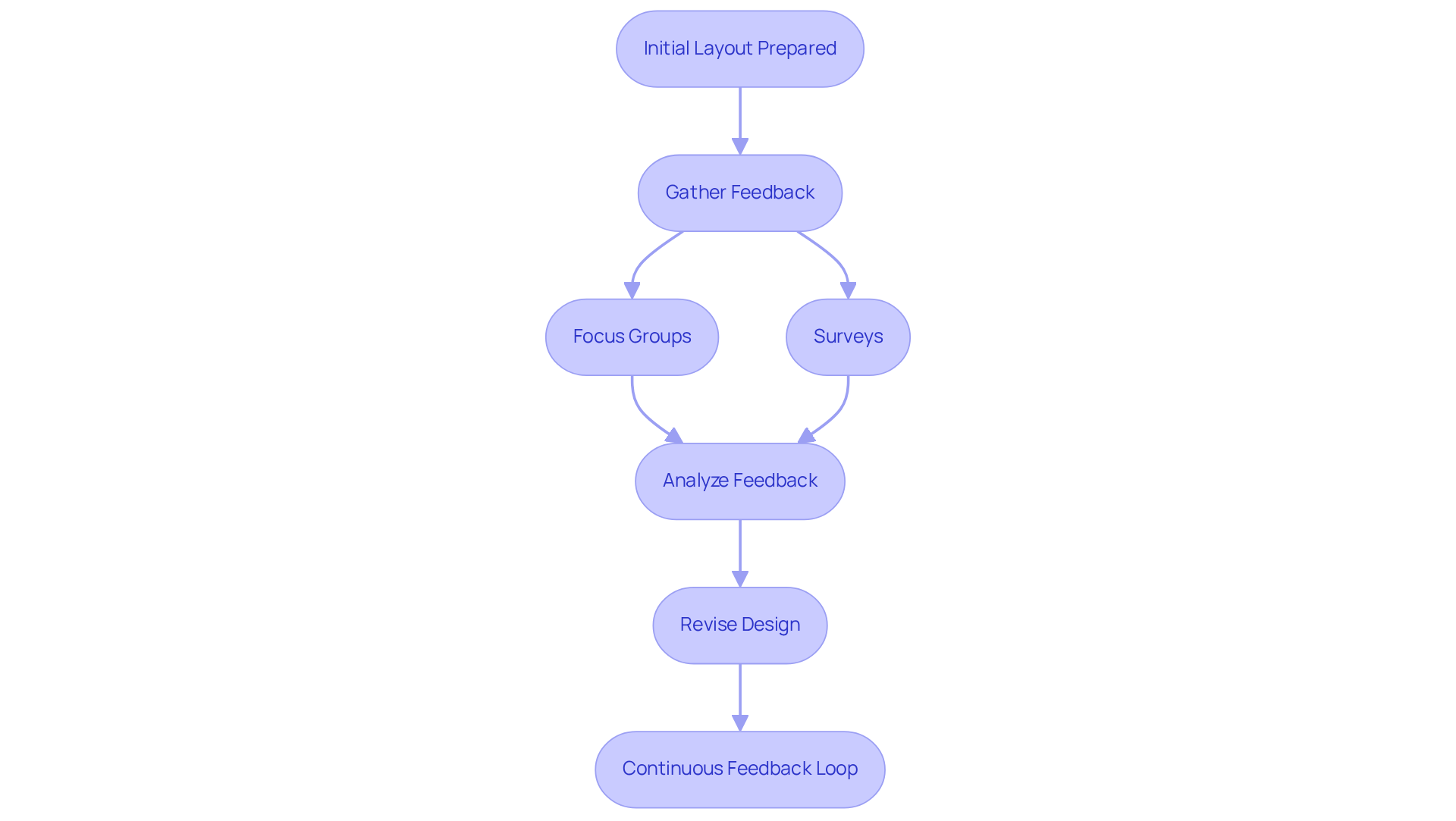
Once you’ve got the initial layout of your prepared, it’s time to gather some feedback from potential users. You might be wondering how to do this effectively - consider running focus groups or surveys to get insights on how appealing and effective your project really is. Ask specific questions about clarity, visual appeal, and overall impression. As Imed Bouchrika points out, "," which really highlights how crucial is for making better choices. So, take that feedback and use it to tweak your layout!
Iteration is key here! Don’t hesitate to revise the cover multiple times based on what users say. can help you iterate faster and smarter, ensuring that the final product truly meets user needs. This process not only improves the end result but also gives users a sense of ownership, as they see their feedback reflected in the final design.
Now, let’s talk numbers. With to $98 billion in 2024, it’s more important than ever to make sure your are both effective and engaging. By continuously improving through this feedback loop, you’ll end up with a that really serves its purpose well.
Conclusion
Creating a training manual cover that really stands out? It’s all about taking a thoughtful approach! You’ll want to focus on understanding your audience and the purpose behind the manual. Think about integrating some eye-catching visuals and branding, making sure everything is clear and easy to access, and don’t forget to embrace feedback for continuous improvement. By prioritizing these aspects, your design can truly resonate with users and enhance their learning experience.
So, what are some key strategies to keep in mind? First off, defining your target audience is crucial. This helps you tailor your design choices to fit their needs. Then, there’s branding - utilizing it can create a cohesive identity that users will recognize. And let’s not overlook clarity; ensuring that your content is accessible to everyone is a must! Plus, gathering feedback and iterating on your design is super important. It leads to a final product that genuinely meets user needs and expectations.
Ultimately, an effective training manual cover is more than just a pretty face; it’s a vital tool for facilitating learning and engagement. By implementing these best practices, you can create training materials that not only inform but also inspire. This fosters a culture of continuous growth and development. So, why not embrace these principles? Elevate your training manuals and empower your audience!
Frequently Asked Questions
Why is it important to define the audience for a training manual cover?
Defining the audience is crucial because it helps tailor the content and design of the manual to meet their specific needs, enhancing engagement and effectiveness.
What factors should be considered when identifying the audience for a training manual?
Factors to consider include demographics, roles, and their familiarity with the topic. For instance, a manual for new hires will differ significantly from one intended for experienced professionals.
How does stating the purpose of the manual influence its design?
Clearly stating the manual's purpose-whether for onboarding, skill development, or compliance training-guides the design choices, ensuring the cover resonates with the intended users.
What methods can be used to understand the audience better?
Interacting with the audience through surveys or interviews can provide valuable insights into their preferences and expectations.
What impact does tailoring educational content to different audiences have on employee retention?
Companies that tailor their educational content to different audiences are twice as likely to see better employee retention rates, indicating the importance of aligning resources with audience needs.
👍
What others are liking
5 Steps to outline your ideal documentation structure
5 MINS READ
Where to start the your journey of mapping out your ideal documentation structure, aligning it with the very heartbeat of your organization?
Defining a winning level of detail in your process
3 MINS READ
What is too much detail, and what is too little? This article described in that winning level detail about what detail is enough.


